Super Aqua Club – New branding for the Pointe-Calumet water park
Client: Super Aqua Club
Branding
Advertising
B2C
With a new corporate direction in place, Super Aqua Club (SAC) wanted to leverage its new entrepreneurial momentum and put its brand back on the map.
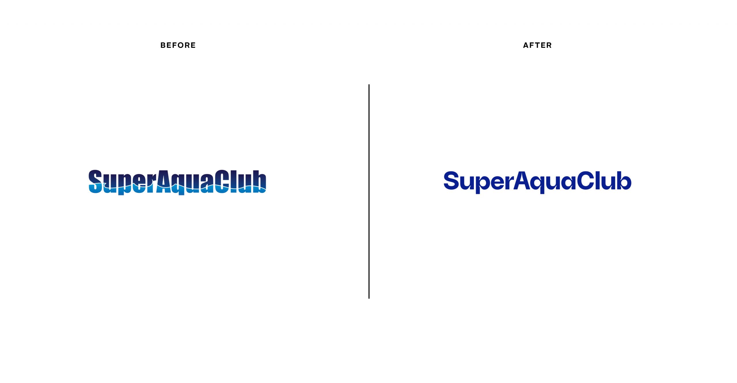
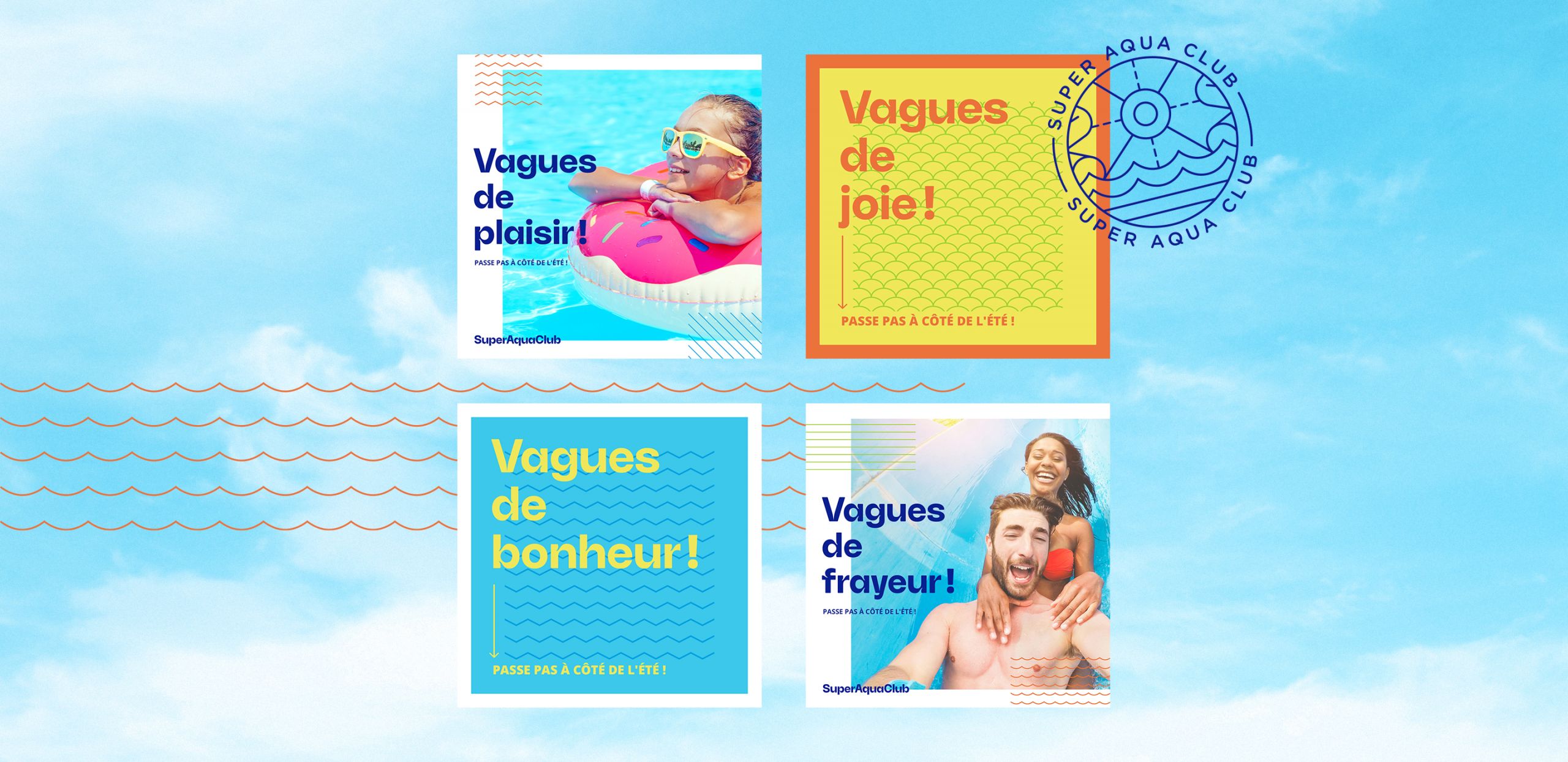
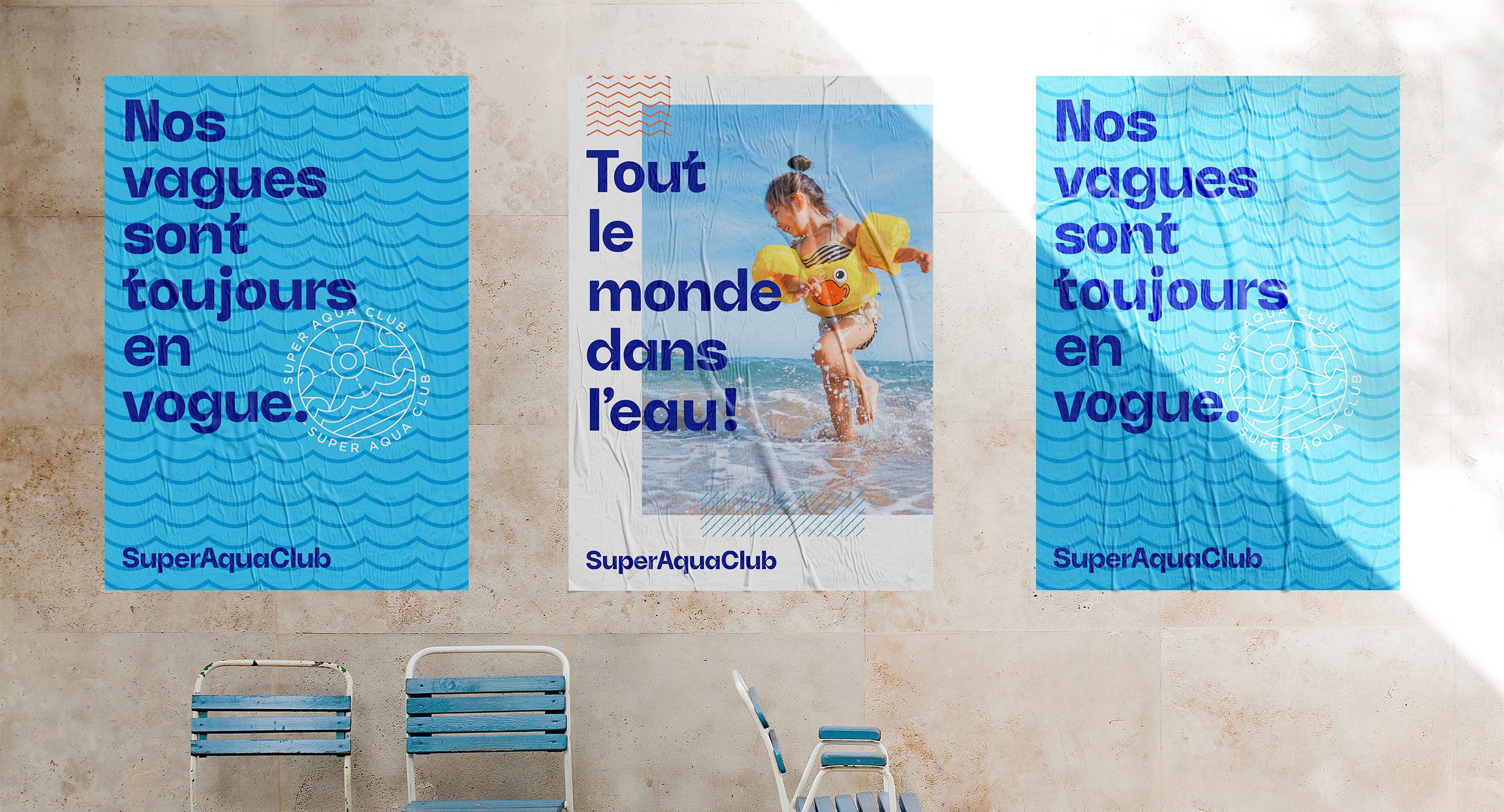
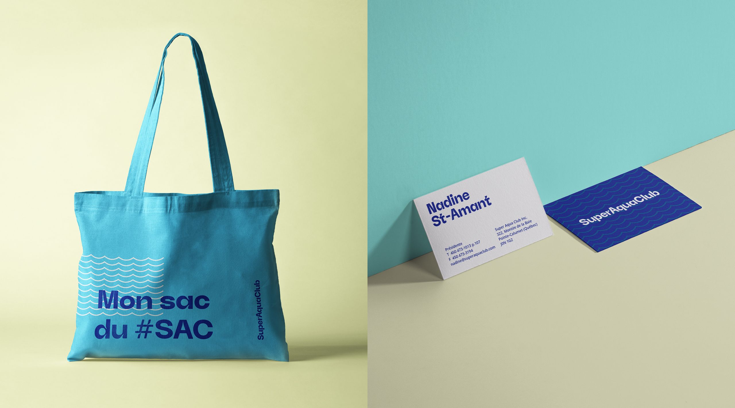
We decided to move away from tangible elements such as the attractions, the site, the proximity to Montreal or even related services. Having a multi-attraction water park isn’t enough anymore. Indeed, customers take it for granted that they are paying for this type of service. We focused the new brand positioning on an entertainment experience that goes well beyond the attractions. By providing a human, engaging experience along the customer’s journey, it’s possible to exceed expectations and create memories.
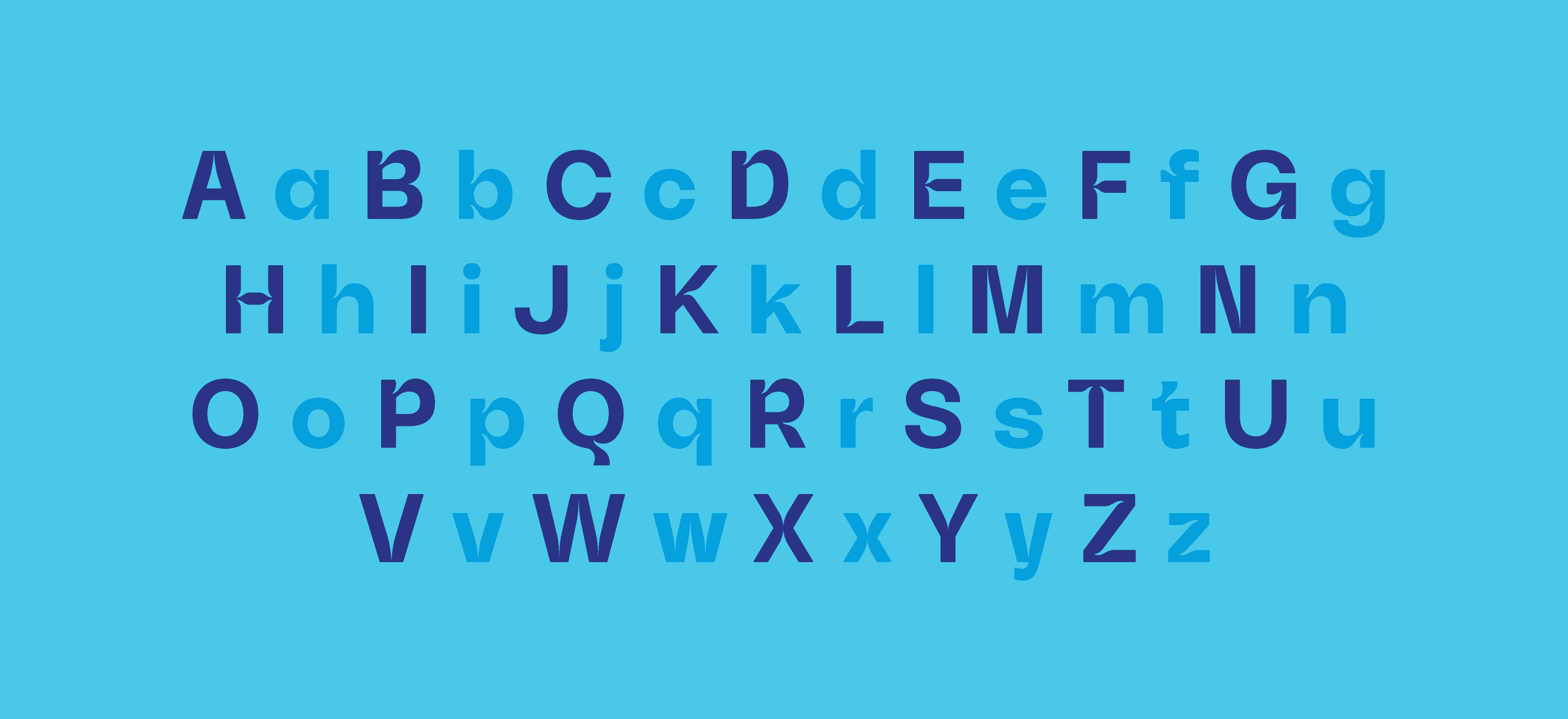
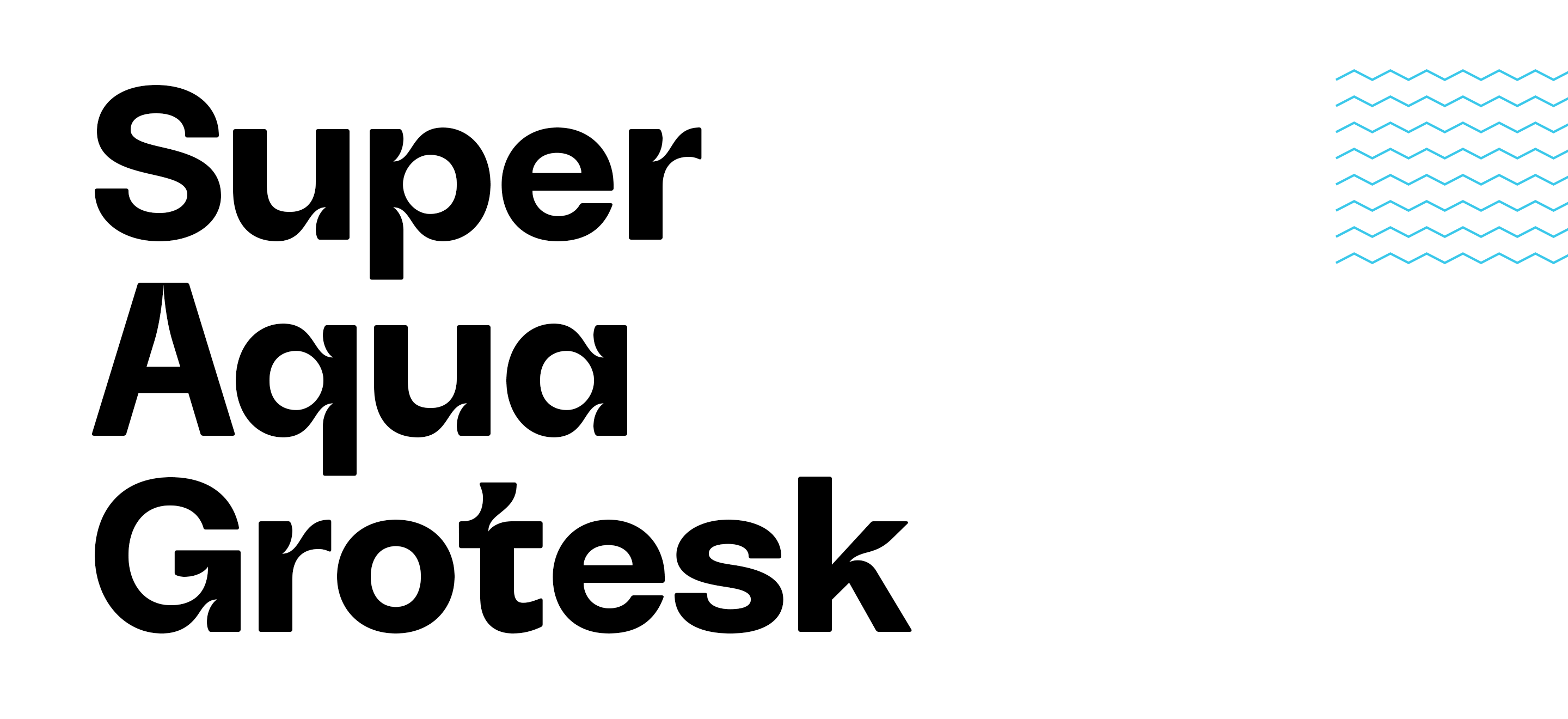
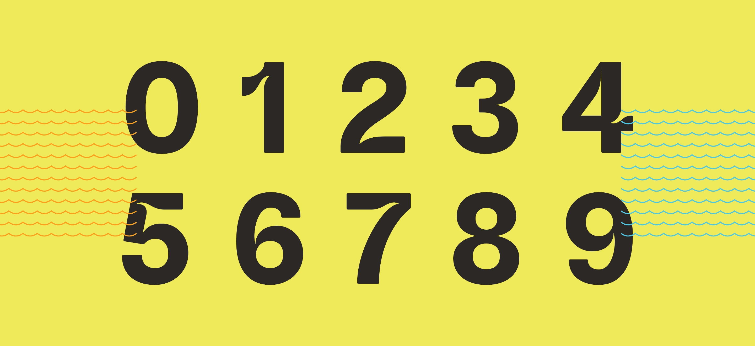
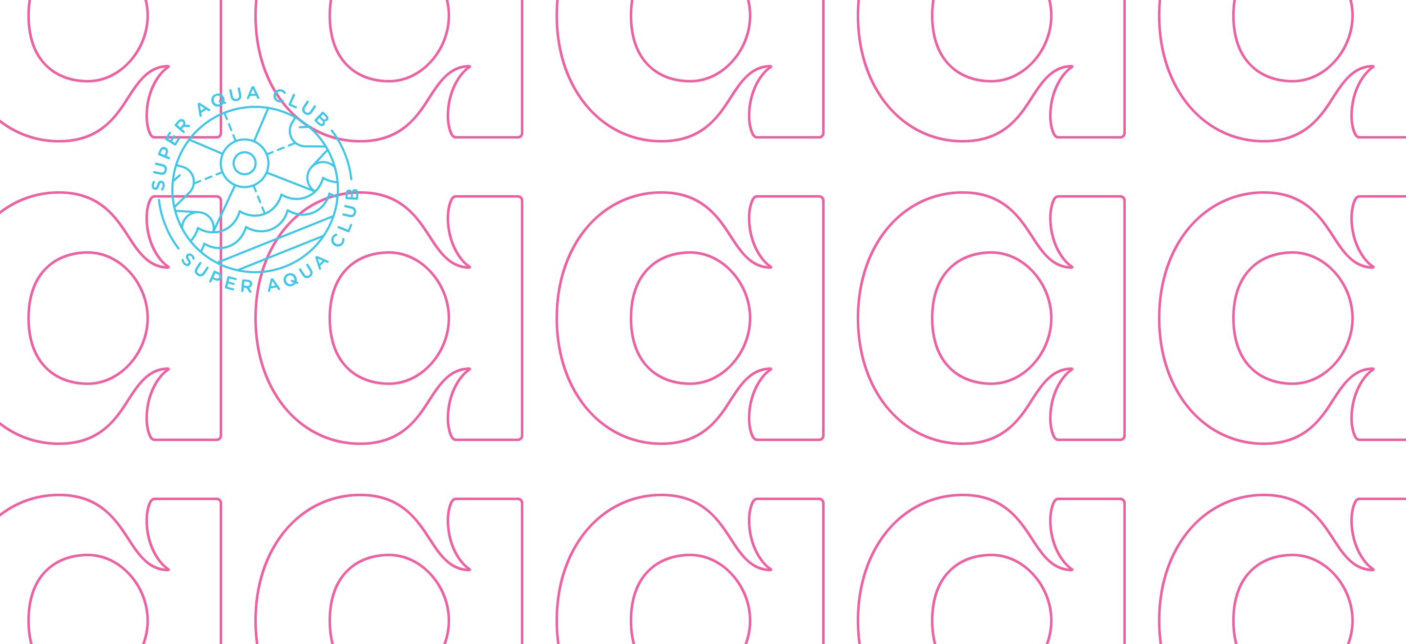
A joker in our game
We didn’t know, though, that we had a joker in our game. It appeared in the middle of the creative process while we were doing typographic research. When we were designing the logotype, an interesting opportunity emerged. Why not use ink traps to “make waves”? Then, we took this concept one step further and proposed a custom, exclusive typeface to the client, a valuable asset for the brand. It was a risky leap of faith because it wasn’t part of the initial plan. The water park/typography link was simply too powerful not to pursue.