Floral – New branding for a third-generation business
Client: Floral
Branding
Com
B2C
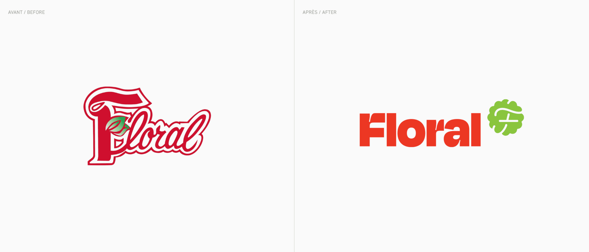
With the third generation of the Charbonneau family firmly in place, Floral is capitalizing on this new entrepreneurial momentum to unveil its new brand identity.
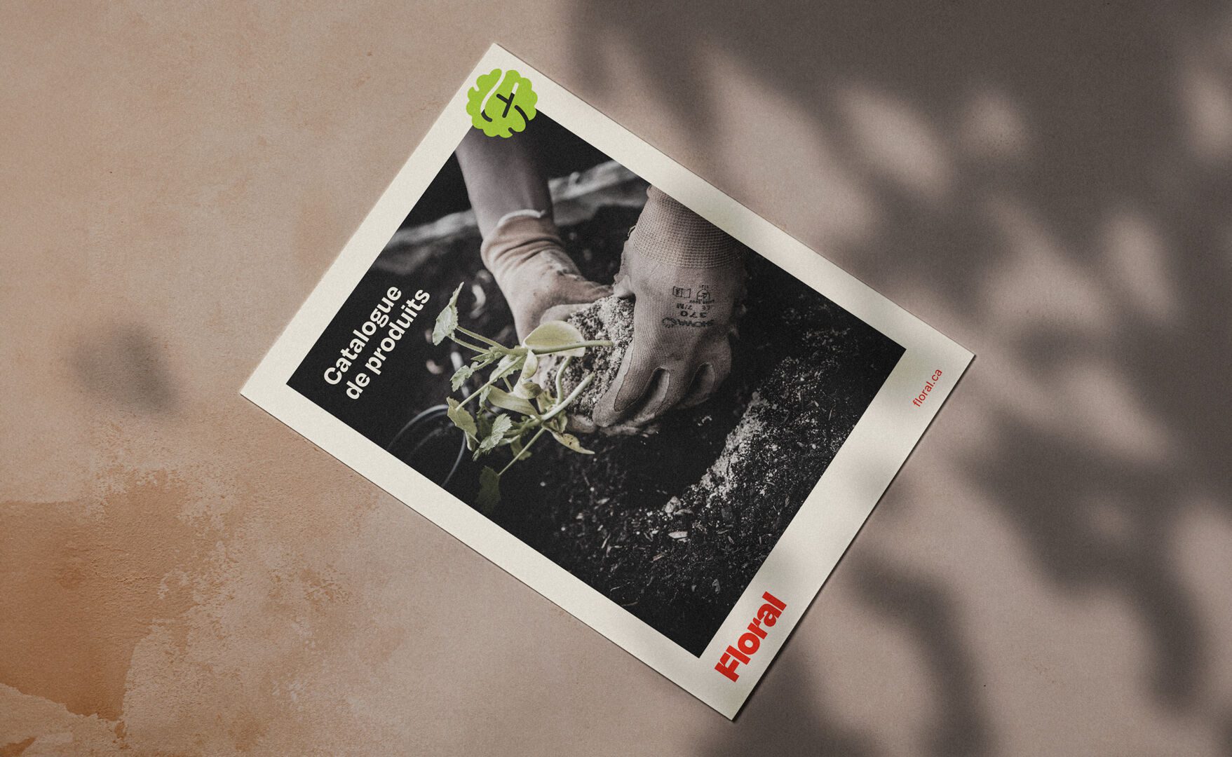
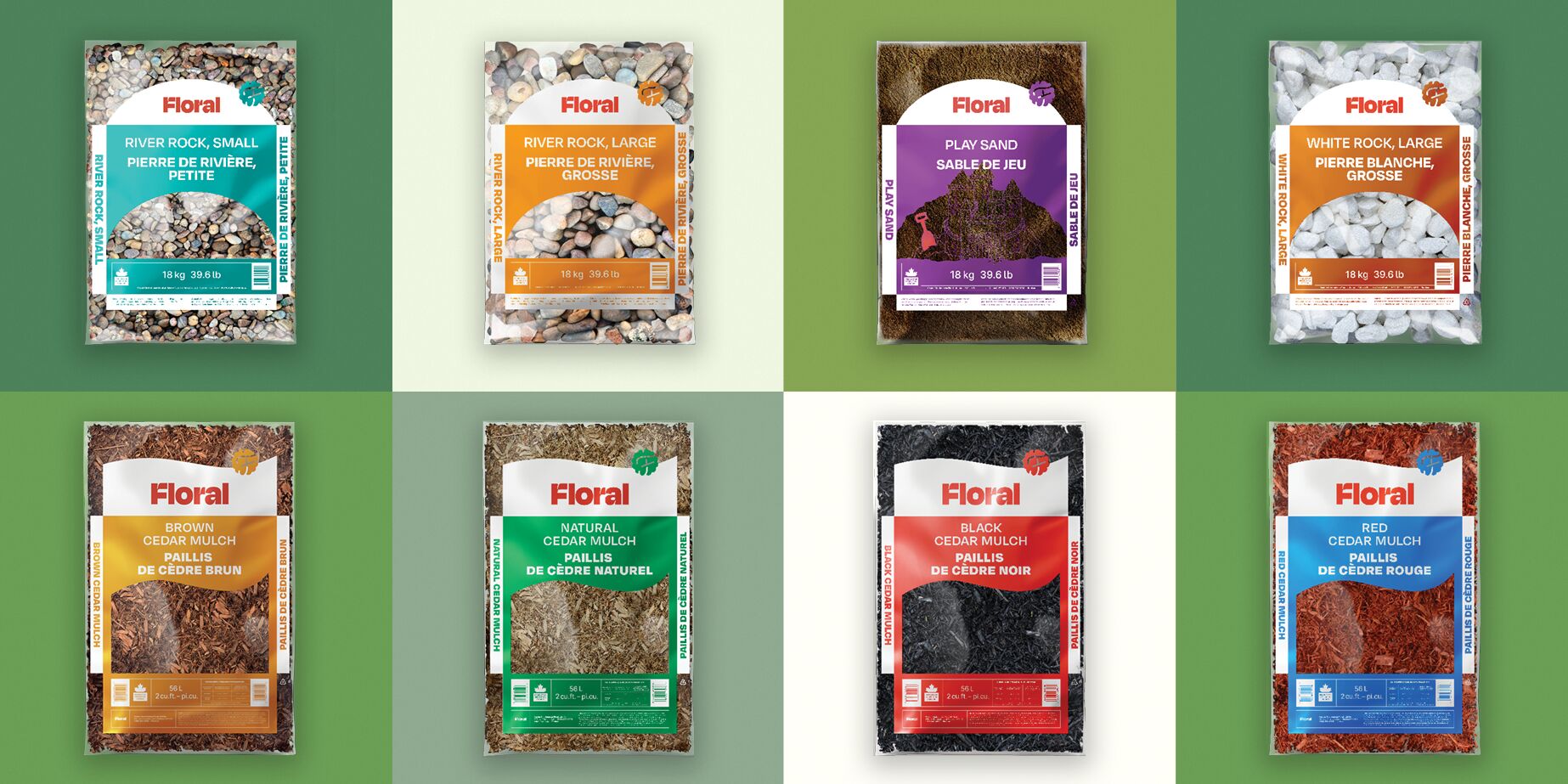
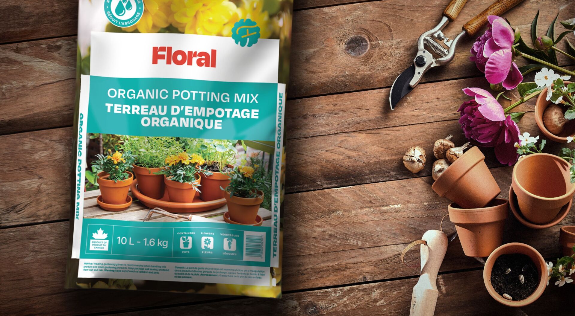
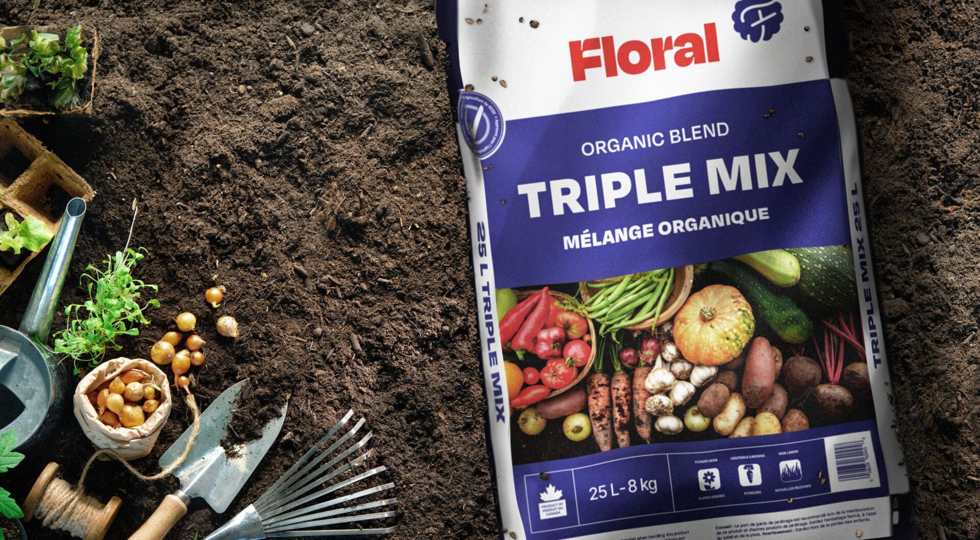
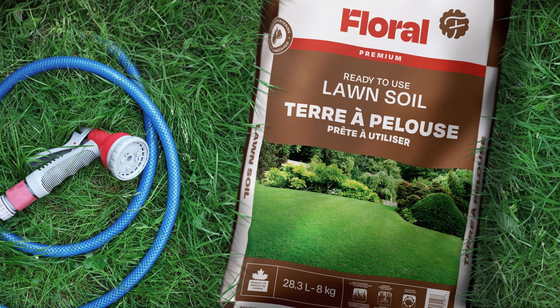
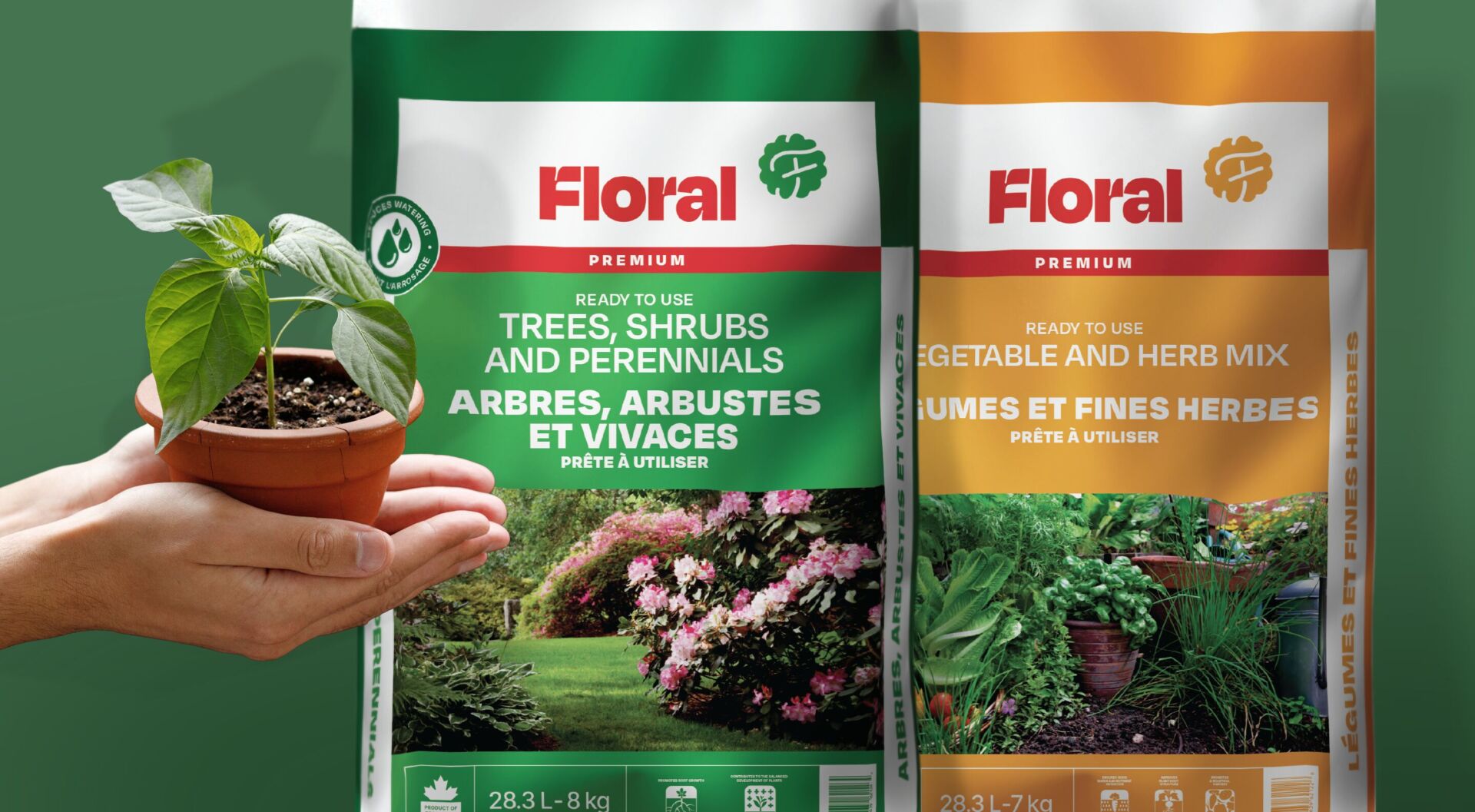
Floral sells gardening products, including indoor potting mix, lawn soil, black earth, garden soil, cedar mulch, decorative stones, compost, manure, and gravel. Primarily in the winter, we are a wholesaler of heating products like firewood, kindling, and eco-friendly logs.
Using the ‘F’ in multiple ways
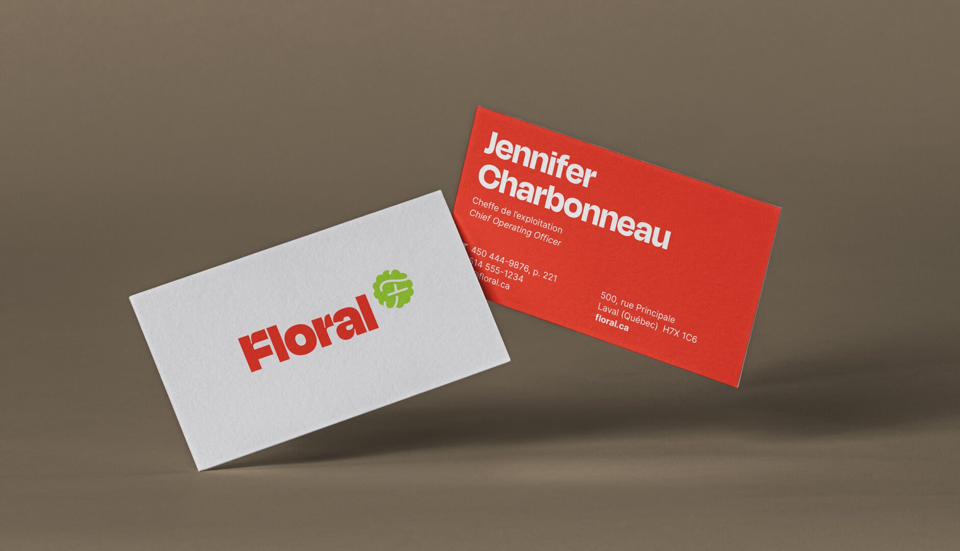
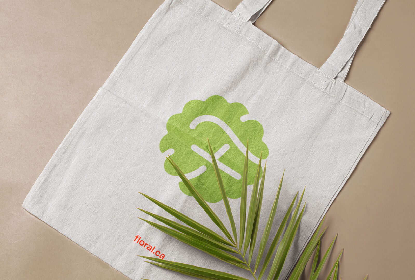
We came up with the idea of using the ‘F’ of Floral as a symbol rather than within the logo itself. Friendly and accessible, it represents the fusion of three concepts: the seal of quality, the flower, and the F of Floral. The new, unique, and modern sans-serif font contrasts well with the rather refined symbol.
