A new brand identity for the QCTH
Client: Quebec Council on Tobacco and Health
Branding
Gov./Asso.
Since 1976, the Quebec Council on Tobacco and Health (QCTH) has worked to eliminate the leading cause of preventable death in Quebec: tobacco use. The organization mandated Macadam to modernize its image in line with its growing outreach.
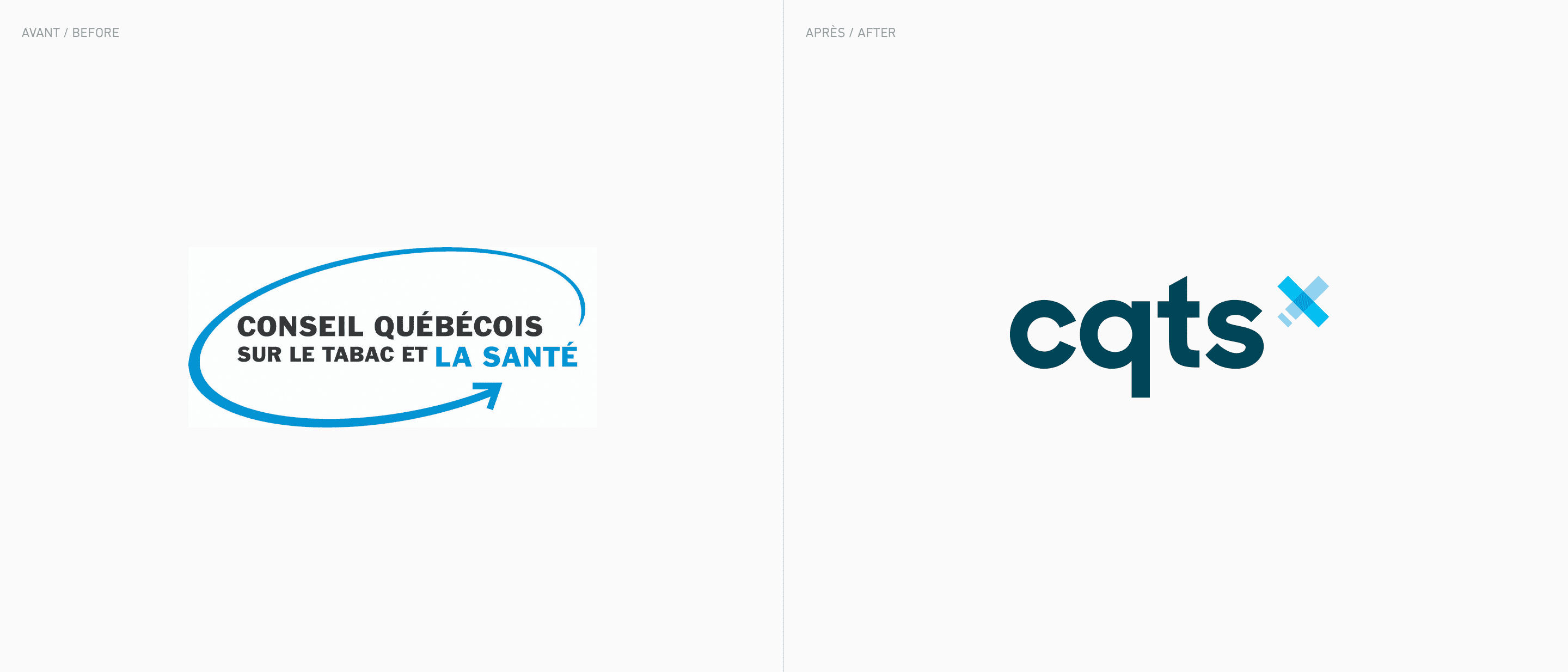
While QCTH projects have been bold, mobilizing, and friendly, the brand has been rather discreet in the tobacco use control ecosystem. And yet, the organization has all the expertise, projects, and credibility it needs to extend its leadership fully. That’s why we sought to align the QCTH’s identity with its brand image
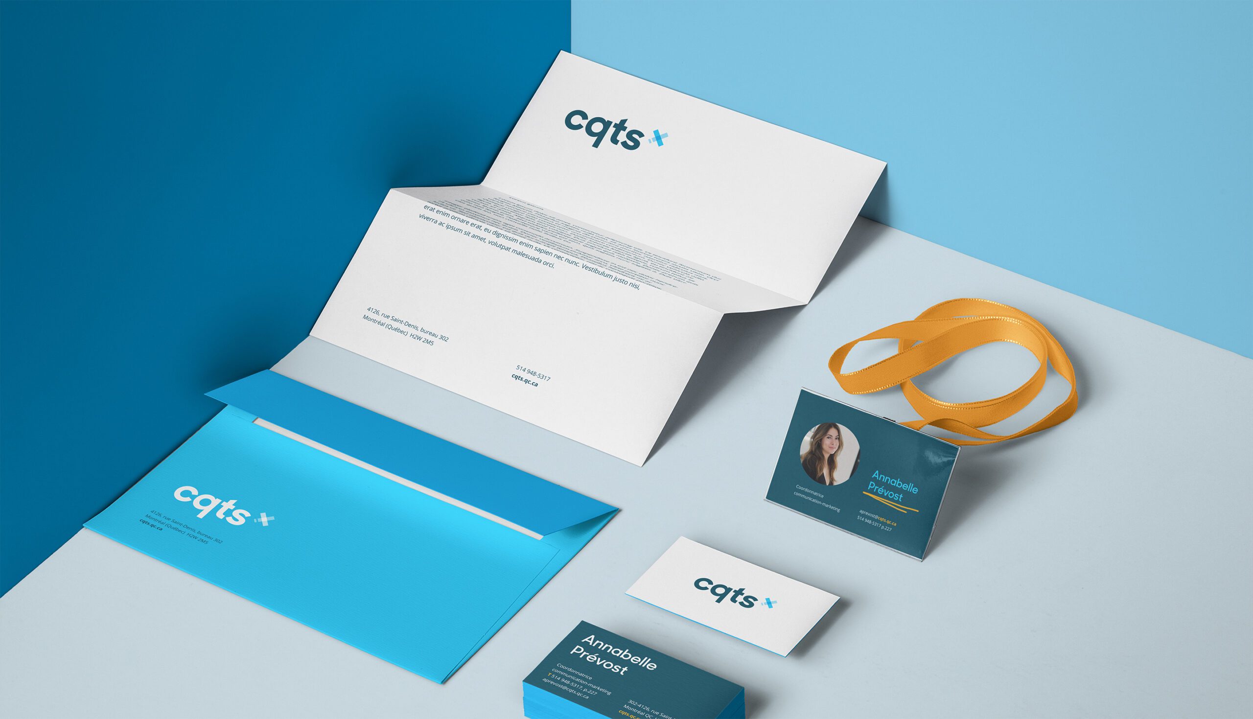
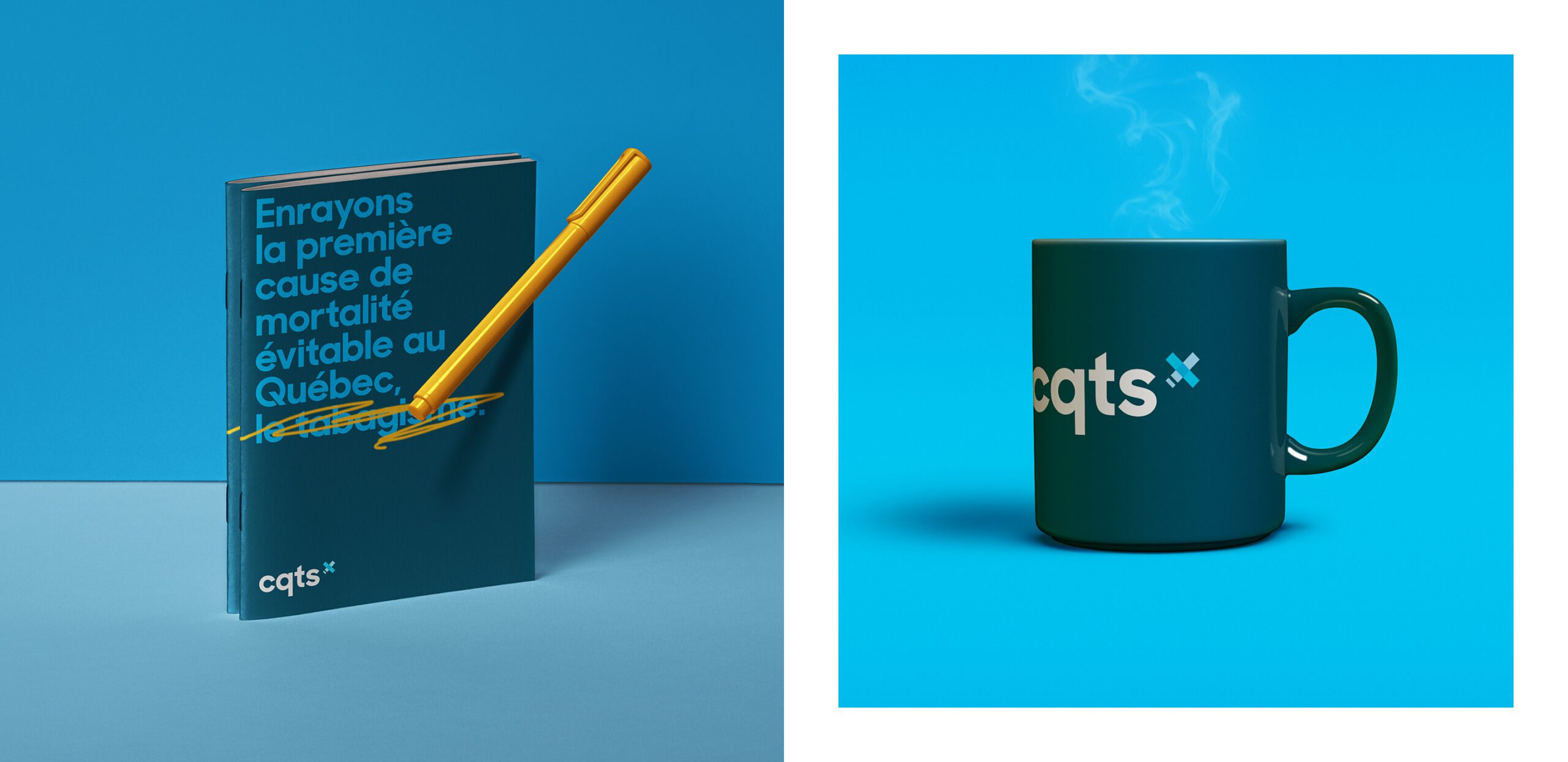
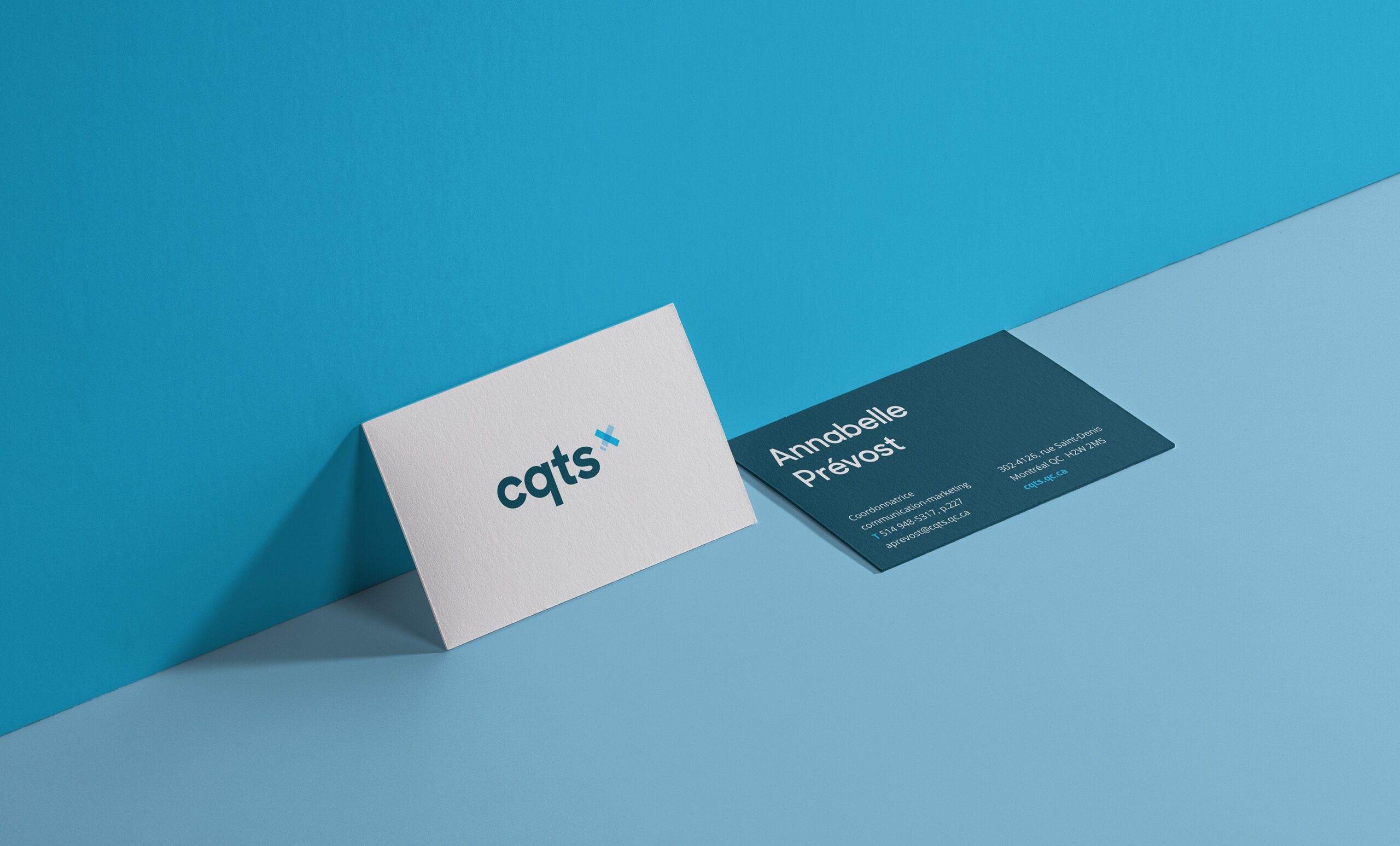
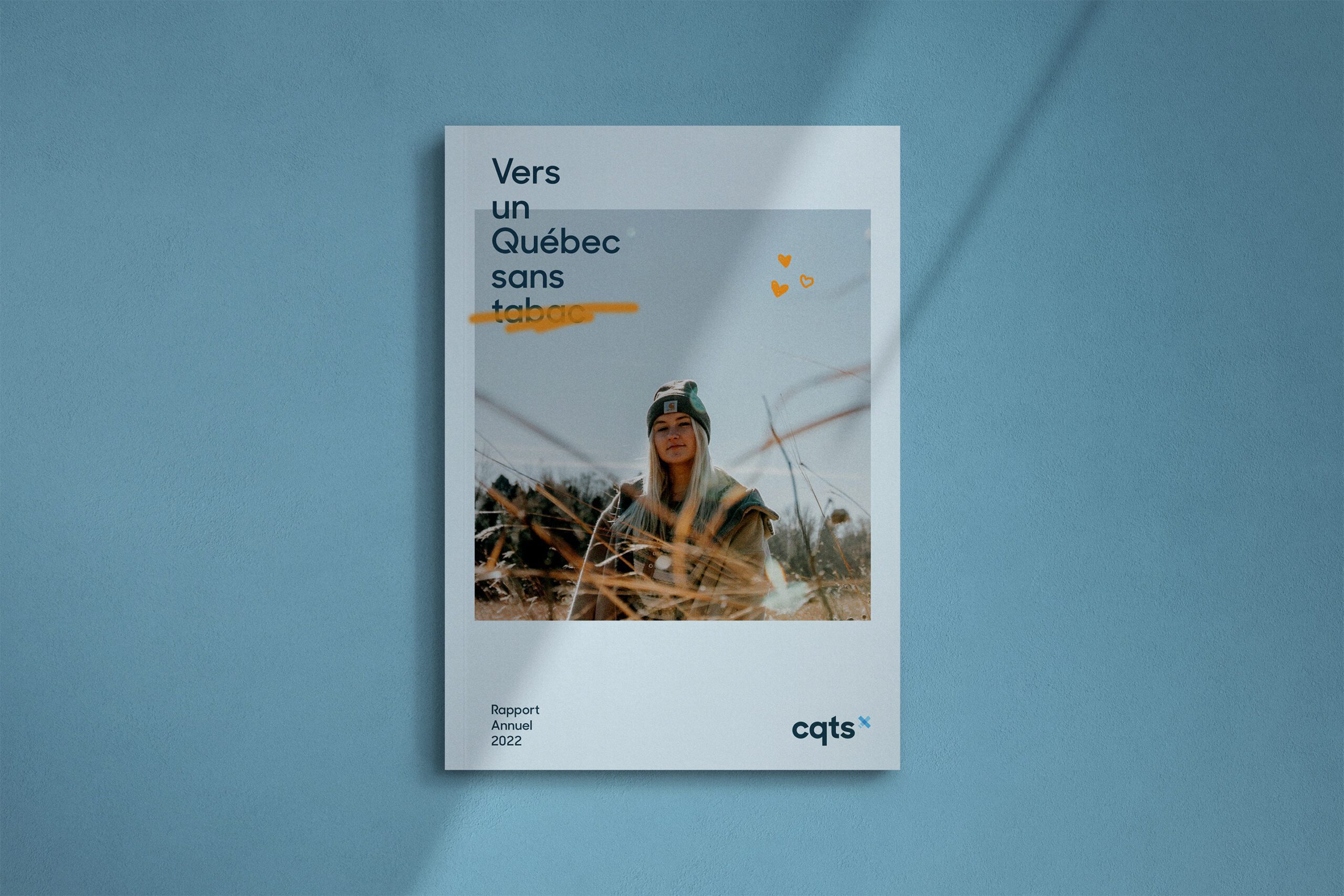
With this goal in mind, we developed an accessible, warm, and reliable brand image. The modern-looking, highly visible, lowercase stick font makes for a welcoming and friendly logo. The dominant blue colour exudes a sense of calm, trust, loyalty, wisdom, and stability. The symbol’s transparency conveys the notion of providing advice and education to various audiences. The orange pencil stroke adds a touch of boldness, madness, and warmth to a professional brand image.
