Lime Health – New branding to connect with patients
Client: Lime Health
Branding
B2B
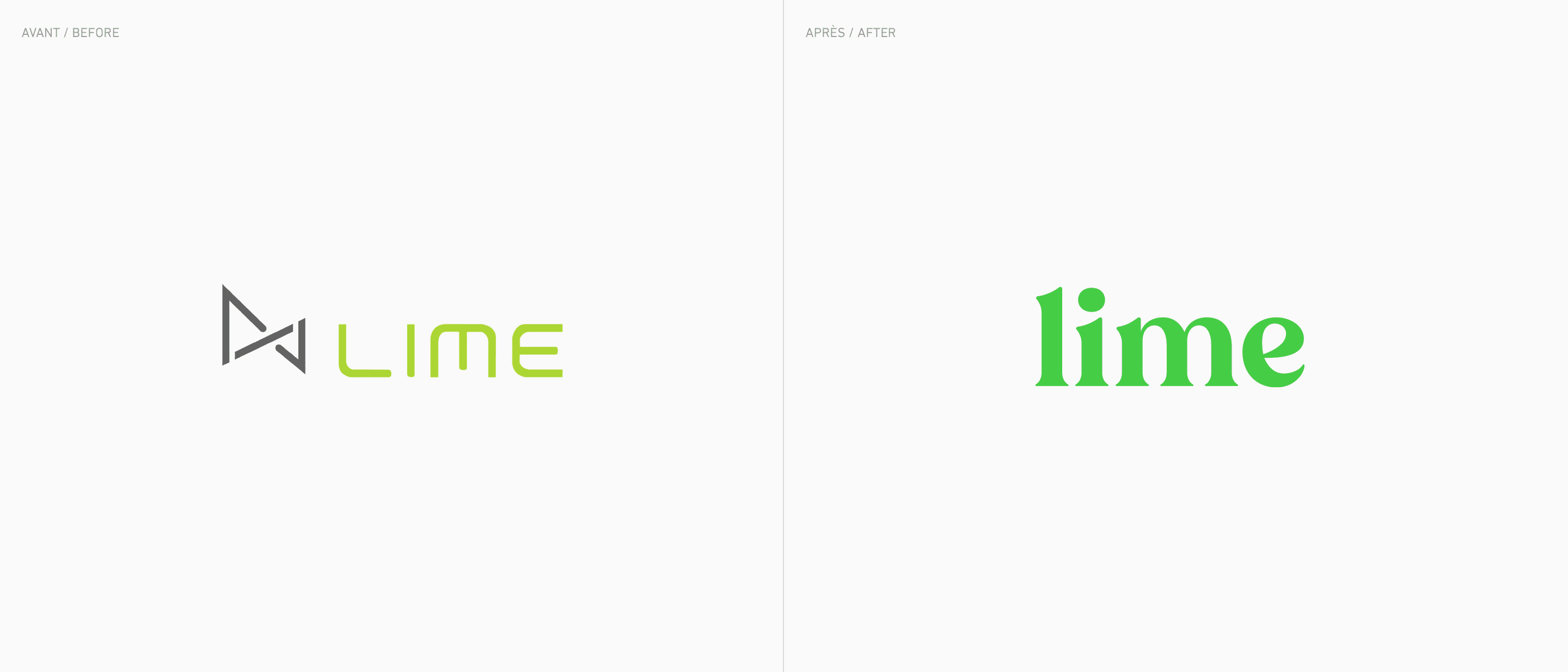
Founded in 2020, Lime Health specializes in creating SaaS-based IT products designed to improve the patient experience during hospital visits. The company’s products and services aim not only to optimize operational costs for hospitals, but also to positively impact the relationship of patients with their healthcare providers. Macadam was contracted to redefine the brand’s strategic positioning in the current highly competitive and ever-changing market. To this end, we developed a new brand image for the company, one that would be more human, warm, and friendly, while remaining credible.

Leveraging a strong brand
The Lime name is a great asset in and of itself, as it’s short, easy to pronounce and simple to write. To further differentiate the brand, we took inspiration from the Recoleta font to create a custom font for the logo. This font has been very popular since its launch in 2018. The result is a nice, but not too bubbly, serif font.
For obvious reasons, we chose lime green, as it’s one of the few colours that’s simultaneously warm and cool. While green is usually a cool colour, the yellow undertone prominent in lime green adds a very welcome touch of warmth.
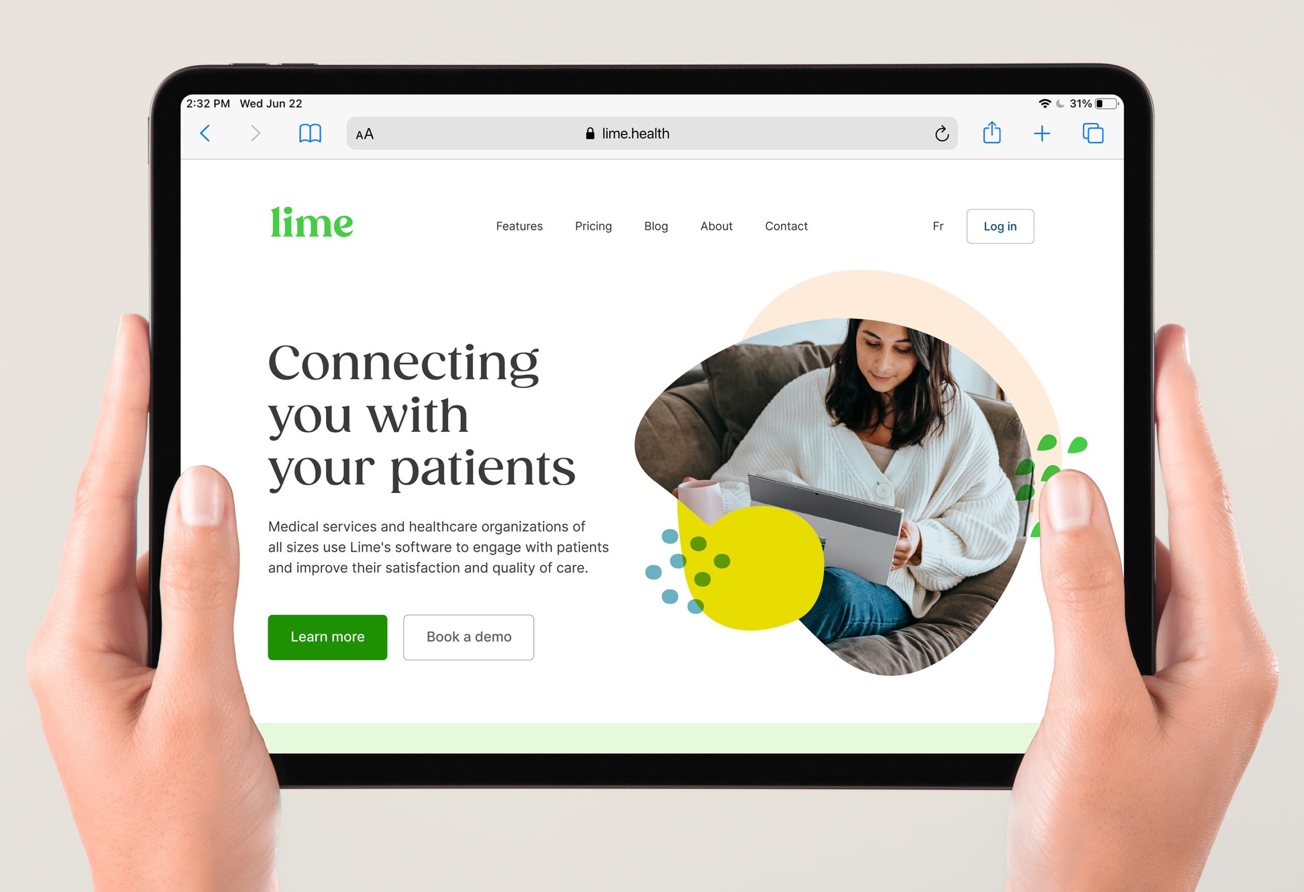
Finally, we developed an organic visual language that incorporates some of the logotype’s shapes and used a varied colour palette that features cool, warm, and neutral colours and contrasting typefaces to ensure a clear hierarchy.


